When creating my digipack, I need to keep a constant colour theme aswel as constant font. This is so they are as clear and readable as possible. From an artistic point of view, this is to also make it more eye catching and like a canvas, expressing his feelings towards a touchy subject of stereotyping.
Below is an example of clear fonts that can and should be used in order to create a successful media product.
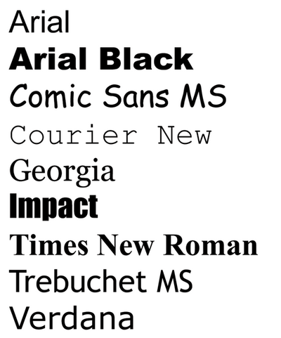
I will be using the font 'IMPACT' as it is a clear and bold font. It also stands out amongst the other fonts. I was originally looking at 'Arial Black', but then realised its overly used and popular.
I am also going to be using a constant colour theme of orange, white and black. The orange will relate to the music video due to the prison. The black will represent the darkness he feels that he is in due to the stereotypes. The white will represent the pure that is to eventually come.

No comments:
Post a Comment