
Tuesday, 28 December 2010


Wednesday, 15 December 2010
Digipack Mock Up
The following is a hand done digipack mock up of the back and front cover. I done a mock up in order to see what my final product would look like roughly. If I stick to the mock up then my product should be the digital version, but obviously a lot neater.


Short List of Fonts and Colours
When creating my digipack, I need to keep a constant colour theme aswel as constant font. This is so they are as clear and readable as possible. From an artistic point of view, this is to also make it more eye catching and like a canvas, expressing his feelings towards a touchy subject of stereotyping.
Below is an example of clear fonts that can and should be used in order to create a successful media product.
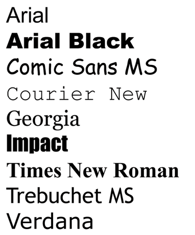
I will be using the font 'IMPACT' as it is a clear and bold font. It also stands out amongst the other fonts. I was originally looking at 'Arial Black', but then realised its overly used and popular.
I am also going to be using a constant colour theme of orange, white and black. The orange will relate to the music video due to the prison. The black will represent the darkness he feels that he is in due to the stereotypes. The white will represent the pure that is to eventually come.

Do's and Dont's
The following is the do's and dont's of a creating digipack or advertisement. If you follow these simple rules then you will have a successful product.
Do's
- Use clear fonts
- Use clear photos that are in focus
- Use aappropriate industry logos and conventions, properly positioned such as barcode, date, copyright, titles and artist name
- Follow the conventions of the 3 colour rule and use colour that is appropriate for: Images, colour and background
Don't s
- Stretch images as this will make them out of focus
- Use unnecessary effects. Any effects used must suit the genre
- Place text across the artist's face
- Feel you need a separate photo on every panel-be creative
- Use font simply because 'you like it'
Tuesday, 14 December 2010
Three Album Covers Analysed

The above album cover is from a band called CKY. They are apart of the rock genre, which is different than mine. I felt as thought I should look at other genres to get ideas and do something different with my genre. I like the fact the above cover is a painted piece of art. The art gives the impression its more than just music, but is a piece of audio art. I also like the fonts used, the 'Carver City' part blends in with the album, whereas the logo stands out.

I like the above album as it features the artist on the front cover. He dominates the cover, which shows he is a dominate artist who is ready to make you fall in love with the music. I also like the font as it matches the artists hair colour. I also like the artistic logo that features to the left of the artist. This album cover may be an inspiration to my future product.

I like the above album cover as it features the parental advisory logo. I also like the fact the artists name is not mentioned. Also the picture relates to the album title 'recovery' as he is walking up a lonely road.
Friday, 10 December 2010
Planning and production: What I have learnt since AS
Since starting my media studies coursework in A2, I have found it a lot more challenging than the previous year. This year we will be creating a music video, a digipack and an advertisement. This is 2 more products than last year where all we made was a opening to a thriller movie. A different approach is to be taken this year, a lot more planning is needed as a lot more shots and locations are needed. This year we are advance editing with base tracks and the razor tool. Lip syncing will also be a challenge.
Wednesday, 8 December 2010
Digipak mock-up


This is a digipak mock-up that I did in my class. Although this is not the finished product I wanted to include some things that are seen on real digipaks such as, barcodes, record labels, track listings, parental advisory copywrite labels, album names and album titles. On the inside panels I wanted to included some things which represents my genre of Political Hip Hop, therefore I included a message from the artist on the inside cover speaking out againsts his oppressors.
Analysis of three advertisements
Public Enemy Ad

Shawty Boy

This advert from a artist called Shawty Boy relates to my genre merely because he also is a rapper. His ad makes it easy for his fans to track him. His Facebook, Youtube and Twitter is displayed clearly in the center of the ad making it simply for fans to follow his music. It also says his record labels and promoters; JBeats, Itsago Music.
M.I.A

M.I.A's Advert here is promoting her new album release and is stated clearly at the bottom her album is going to be released soon. The picture is quite complex but I feel is effective as everyone uses sites like Youtube whic has the play botton at the bottom of every video, so this picture reflects everyone watiching M.I.A video's online.
Monday, 6 December 2010
Sunday, 5 December 2010
Analysis of three digipaks
As my music videos genre was 'Political Hip Hop' I have been reviewing other digipak covers of other political rappers similar to Lowkey.
KRS-One

KRS-One's album cover relates to my genre of political Hip Hop for numerous reasons. For example, it is produced as if it was an election poster, in a sense, in the streets which make it appeal to political rap fans. It also has the artist framed right in the center of the picture which makes him the main center of attention. Also the font used for the artists name is spaced out across the page, it also is in block writing which reflects the artists bold purposes and messages. The colour is green which immediately allows it to stand out from the rest of the cover, thus catching our attenting straight away. The title of the album cover is written in highly colloquial language and is written how the artist and audience would say it, "for da- emceez", this in turn make it more relateable to its intendend audience, Hip Hop fans, thus more appealing.
Public Enemy

Public Enemy's ablbum cover relates to my genre of Political Hip Hop for many reasons. For example, the group members our positioned agin in the center similarly to KRS-Ones's cover, however it is a medium close-up rather than a close up as this is a groups cover. The cover is plain but the members have an sketchy effect implemented on them which makes them appear black and white. The outfits of the characters appears like they are in the military, this reflects the political aspect of their genre and allows the audience to acknowledge what kind of musicians Public Enemy are.The title is sourrounded by a wine sort of colour and it is written is large white writing at the top of the cover, similar to KRS-One's cover. The sheer name oof the group 'Public Enemy' connotes political agenda's and rulers of countries as such. This allows the audience to know they are political rappers and is clear.
M.I.A.
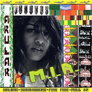
M.I.A's cover relates to the genre of Political Hip Hop just like KRS-One and Public Enemy. For instance, the artist is framed towards the left of the cover and there is borders around the cover withe arabic writing, tanks, flags and airoplanes.This immediately connotes political and perhaps even stereotypical points of terrorism, war and politics, thus allowing it to straight away relate to its intended genre of Political Hip Hop. In comparison, the title is written at the bottom of the page unlike the other two covers. The title itself, 'M.I.A' reflects something polictical, like MI5, for example. It is also presented as if it has been spray painted on like graffeti.
Monday, 29 November 2010
Cover Activity
In today's lesson we were given photos (JPEGs) of a teacher in our college, we had to change these boring and dull images into an album cover. We used Adobe Photoshop to make the canvas, then placed the images onto the canvas. This was our tutorial with Photoshop and getting used to how to edit and create. As you can see, I used many effects on the artist. I used stencil font which I thought suited the image as its all mainly outlines and no colour. I used the same font on the back of the album for the tracks as I wanted to keep it constant. I also added a barcode. Not the most professional album cover, but it was just me getting used to Adobe Photoshop for my real digipack.


Saturday, 27 November 2010
Friday, 26 November 2010
Feedback from rough cut
After having shown our rough cut music video to our teacher, we decided to implement a few changes to our overall media product. For instance, we decided to film more base tracks so that the quality of of lip syncing we appear more realistic. However, we also kept various things like the intro to our video because the shot showed the view from South Bank of Big Ben and it is a well known place.


Our group changed,


Our group changed,
Thursday, 18 November 2010
Monday, 8 November 2010


Location shots
Location shots

This is one of our locations, Old Street. It is here that we are filming our base track for our music video.

The view from South Bank. We used this location because it has a back drop of the Houses of Parliament and Big Ben.

Trafalgar Square. This is where we filmed David in the center of the area so that he would stand out in his orange boiler suit.
Monday, 18 October 2010
Digital Storyboard
Here is our storyboard that we drew on a storyboard sheet supplied by the media department. The storyboard tells the shots we will be using and the main drift of the video.


Friday, 15 October 2010
Digipak Mock-up

Here, I was started planning how I would make my Digipak. I used particular features that real digipak's would feature such as, barcodes and copy right notices. I also included a font that I thought would suit the genre of our song by Lowkey.
Subscribe to:
Comments (Atom)